Logo Design
There’s art and craft to designing logos. There are multiple right answers and a degree of subjectivity. That’s why we create options. Only the lucky chosen one moves on. Here’s a recap of the process for 551 Madison, a boutique office building in the heart of Manhattan.
Getting started
Before putting pen to paper we need to unturn stones and talk about objectives. We speak with stakeholders, explore the landscape, and agree to an approach with the client.
How the name is spoken and written should be determined before starting design. It’s extremely common to have name confusion, even for companies that have been around for a while.
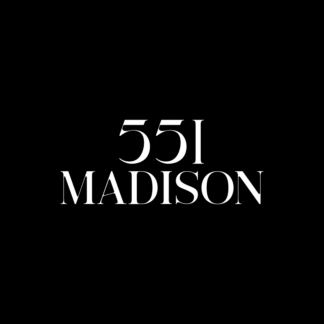
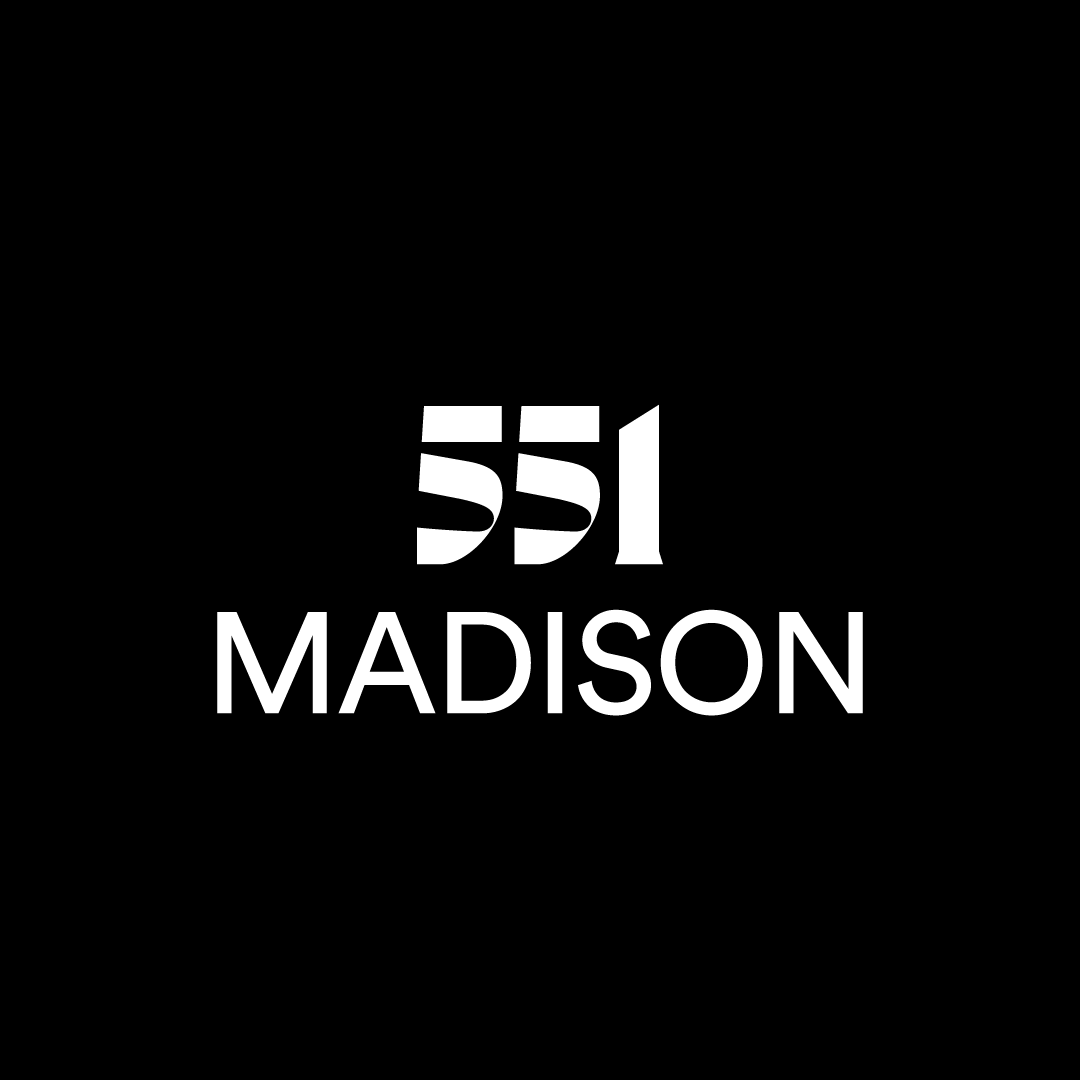
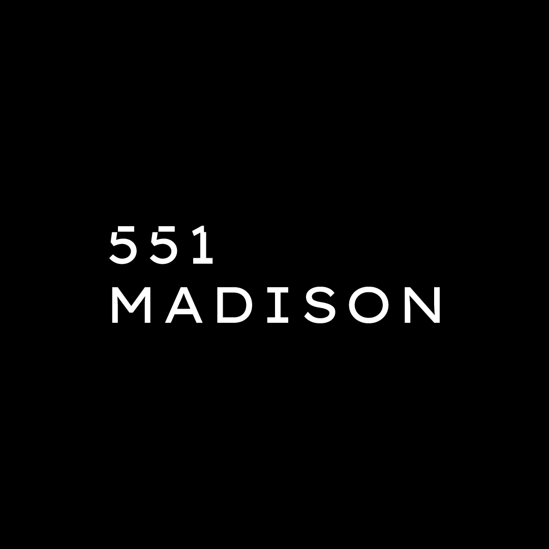
For 551 Madison, there were several naming questions to align on. The first was whether to include ‘Ave’ or ‘Avenue’ in the name. The client decided not to, opting for simplicity and a more modern style. No one on the client side had any attachment to the extra word, and noted that New Yorkers don’t need it. 551 Madison is clear.
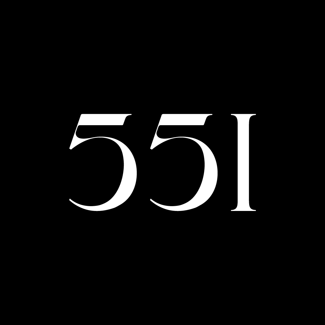
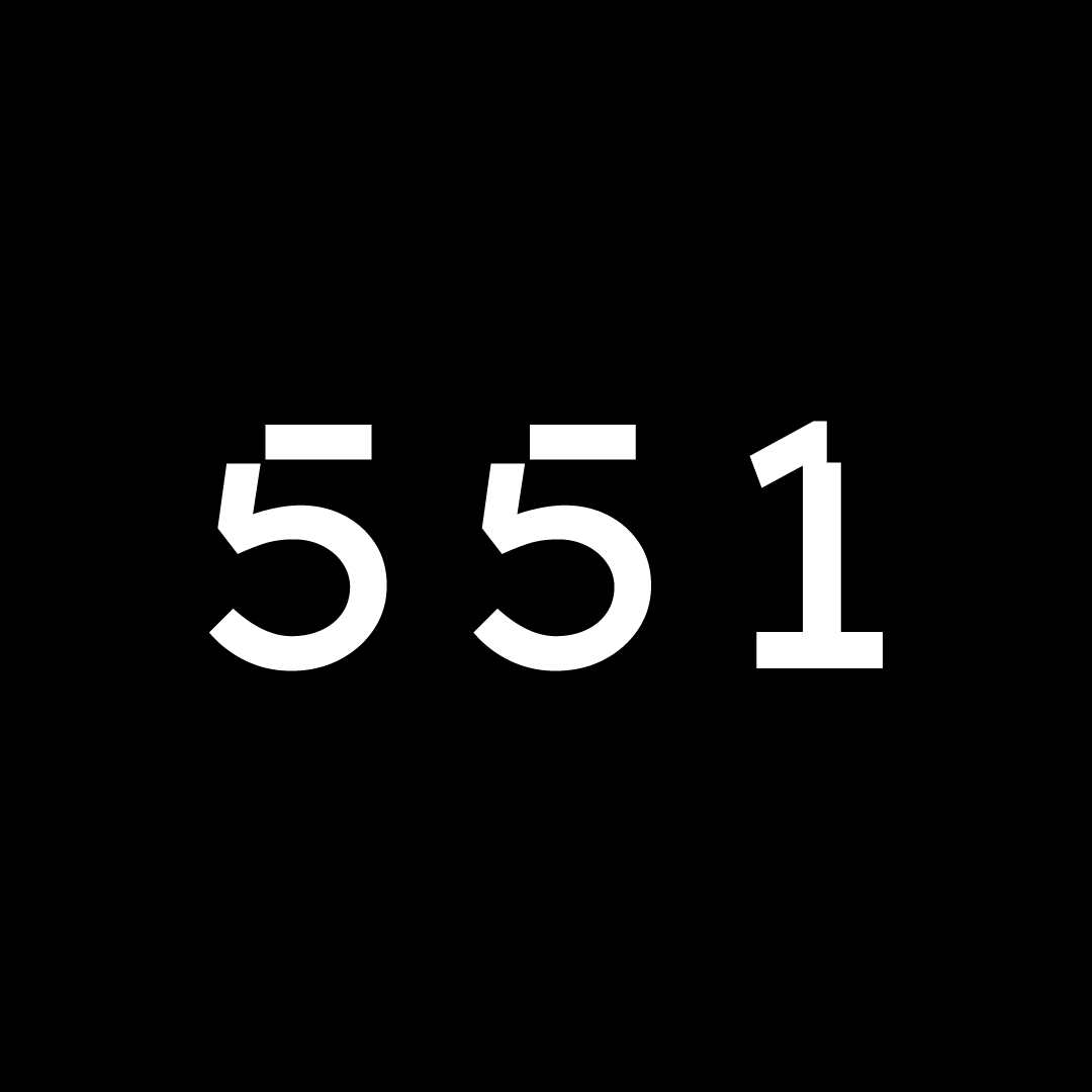
Another question was how to say 551 Madison. At the time, it was fluctuating between ‘five-fifty-one’ and ‘five-five-one.’ For brevity, the latter was chosen. It was also decided there would only be two acceptable uses of the name: 551 (short) and 551 Madison (full). No other variations would be allowed.
Once the name and variations were decided, logo design could begin.
Creative exploration
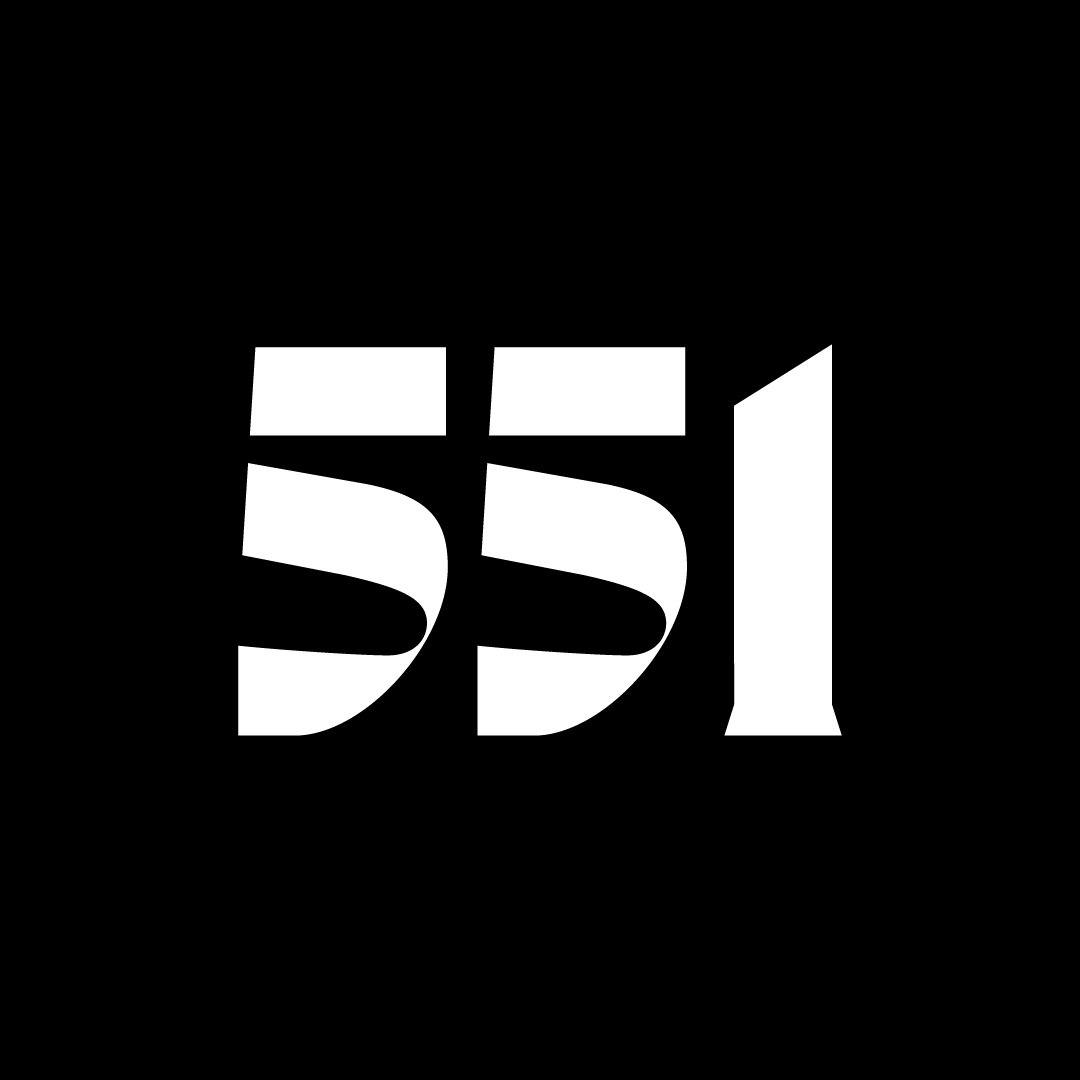
In order to be creative, one must create. The exploratory phase is loose and fast, allowing the designer to cover lots of ground in a short amount of time. Hundreds of quick attempts might be explored, with versions and variants of weights, alignments, and typefaces.
This try-anything approach combines on-paper sketching and computer-generated exploration. These are always done in black and white, so as to focus fully on form and to move quickly. No time is wasted. Explorations are often left unfinished. If it’s not working, simply leave as-is and move on.
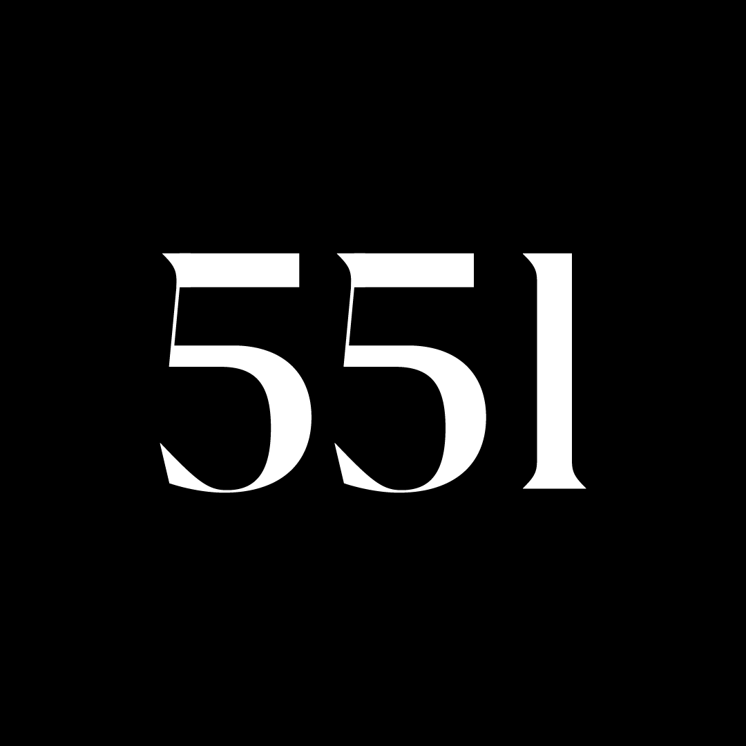
For the 551 Madison project, since the client had indicated a desire for an extra-unique typographic style, custom lettering was explored. These were done by hand and scanned-in, and by manipulating within the computer to achieve the desired effect. In line with the nature of this phase, these were always kept sketchy and explorative.
There’s really no rule for how long to stay in exploration phase. It should be long enough to come up with interesting and fresh options, yet always with a sense of productiveness and momentum. Speed is actually ideal when exploring—which means that half-baked and fearlessly out-there concepts are encouraged. No one outside of the creative studio needs to see discarded options. Designers should feel a sense of freedom to be creative, and for now, shielded from outside critique.
When options naturally start winnowing down, it’s time to wrap up the exploration phase. Between five to ten concepts with the most potential are selected to advance. Only these will be cleaned-up and finalized for presentation.
At Design Minded, messy initial exploration files are always appended with ‘WK’ which stands for ‘working.’ This is to alert anyone revisiting old project files to expect raw, sketchy work, and plenty of missing fonts. Rarely do we open old working files to rescue discarded options. But just in case, they’ll be there.
Presenting logo options
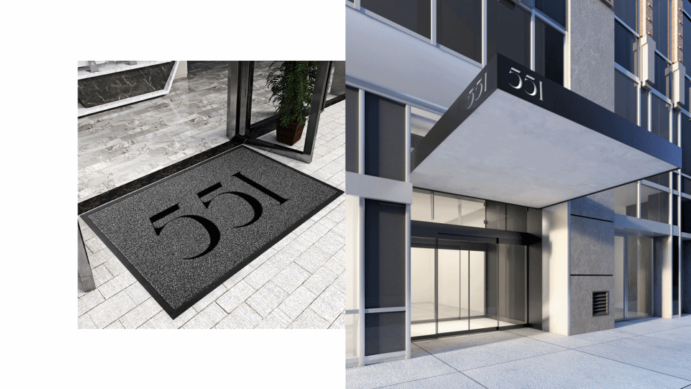
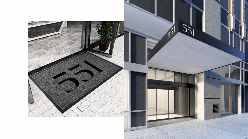
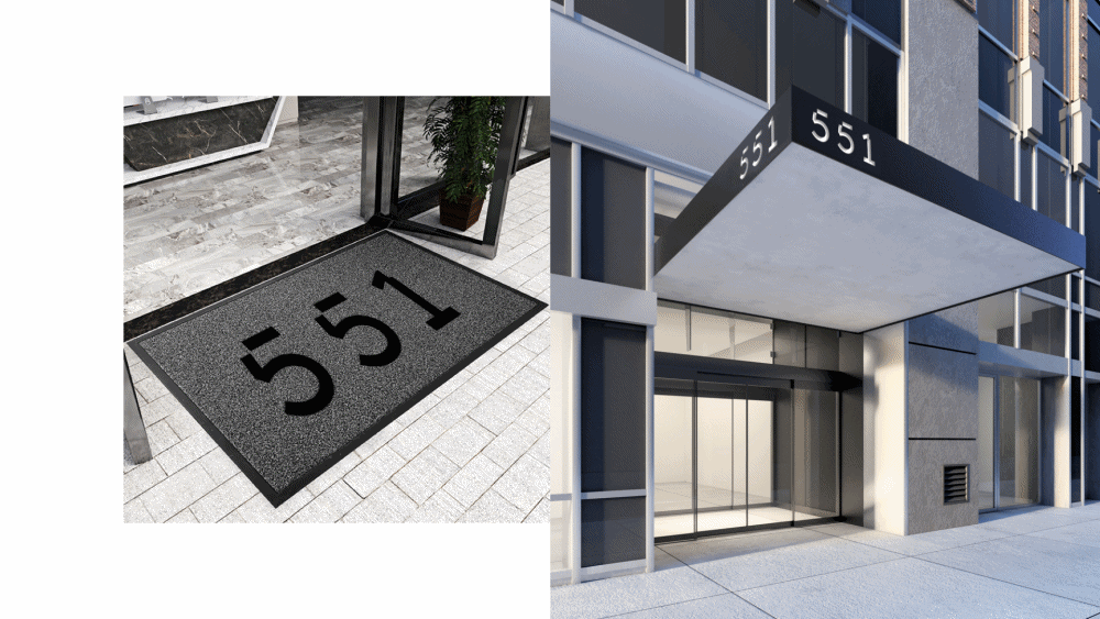
Each option is shown at different scales and on proof-of-concept applications. Things like totes, umbrellas, t-shirts, and signage are mocked-up with logos applied. This allows the client to envision real-world applications and make an educated decision.
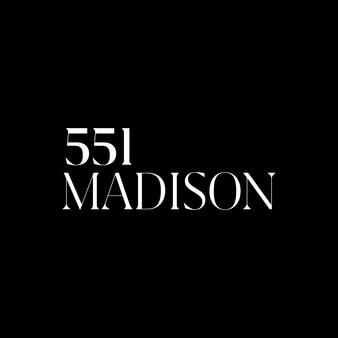
For this project, there were two logo versions—short (551) and long (551 Madison). Both were shown in various sizes and applications. Mockups at this early stage are very easy to make, and it’s nice to have iterations reviewed early-on.
The first round of logo options are always presented in black and white. This is to focus on form, without the subjectivity of color pulling anyone’s attention. Color is highly emotional, and can inadvertently bias decision-making.
The number of options and rounds is entirely up to the client. This may be predetermined based on budget and timeline. Or, if things are flexible, the client may request additional rounds.
Ultimately, one logo is selected to move forward. Then type, color, elements, design system, and brand collateral will be developed.
Adding color, type, and more
At this point, the logo is complete. But of course, brands aren’t just a logo. They’re a universe of elements, working together to create a cohesive experience. Once the logo direction is chosen, then type, color, avatars, design system, and subsequent brand collateral will be developed.
All of this happens over iterative rounds, and the mockups become increasingly more detailed—putting the logo in fuller context and different formats. While these designs aren’t final, they’re all headed in this direction.
Depending on the scope of work, this might be the website homepage, digital ads, animation, stationery, swag, out-of-home, packaging, brochures, or sales collateral. For 551 Madison, three application concepts were presented: quiet, atelier, and architectural.
While these designs aren’t final, they’re headed in this direction. Refinements are made based on client feedback. The final deliverable will be production-ready files for every deliverable listed in scope, as well as guidelines.