Stage
Stage is an online marketplace and community for women with breast cancer. We designed a brand in the founder’s vision: to help women through this stage of life with dignity, style, and grace.
One in eight women will experience breast cancer in their lifetime. This is a shocking statistic that Stage’s founder learned through her own diagnosis. After a tough battle, she came out of the experience with a profound desire to do something meaningful for future patients who would inevitably walk in her footsteps.
- naming
- visual + verbal Identity
- web design
- packaging
- collateral
- design system
- templates
Stage founder Virginia Carnesale drew upon her background in fashion and e-commerce to create an online marketplace and gifting platform for cancer patients and their loved ones. Offering products to accommodate each phase of treatment, Stage curates essentials with an emphasis on style, beauty, and wellness. The company aims to uplift women during this difficult chapter of their lives, helping them maintain a sense of self, femininity, and confidence.
Design Minded was involved from the beginning. Starting with naming, we led an immersive process resulting in ‘Stage.’ This evocative name speaks to the idea that cancer treatment is a journey. The narrative of impermanence was something that resonated with survivors, and this became core to the brand’s messaging. This is not forever. You will get through this, and cancer doesn’t have to define you.
People with firsthand experience spoke about the intense emotional contradictions that come with a cancer diagnosis. On one hand, out of necessity these women become profoundly resilient. On the other, they’ve never been more vulnerable. Our goal was to acknowledge the challenges of this difficult stage, while positioning it as something that will be over soon enough.
We drew upon emotional complexity for the foundational creative concept. Our brand idea, ‘Cuts and Curves,’ referred to cuts of a scalpel and the curves of femininity. From here, we artfully juxtaposed. Sharp and soft, tough and kind, pain and patience, bravery and fragility, understanding and uplift, disfigurement and beauty. Our intent was to depict the paradox of tough and tender moments that women must go through.
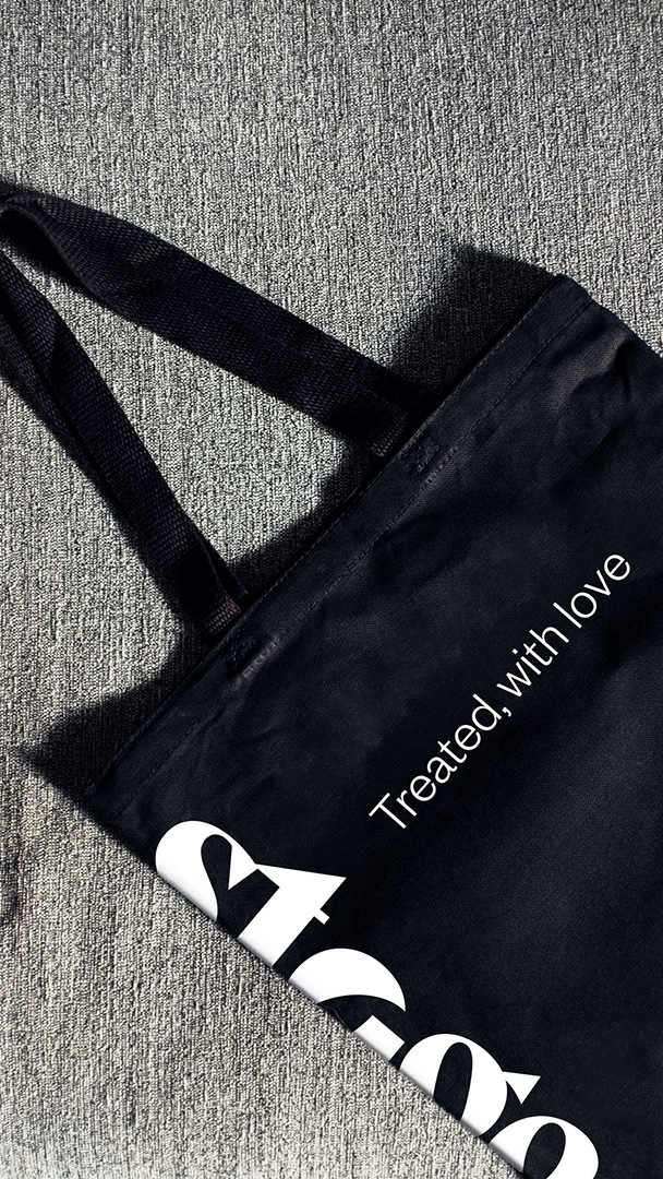
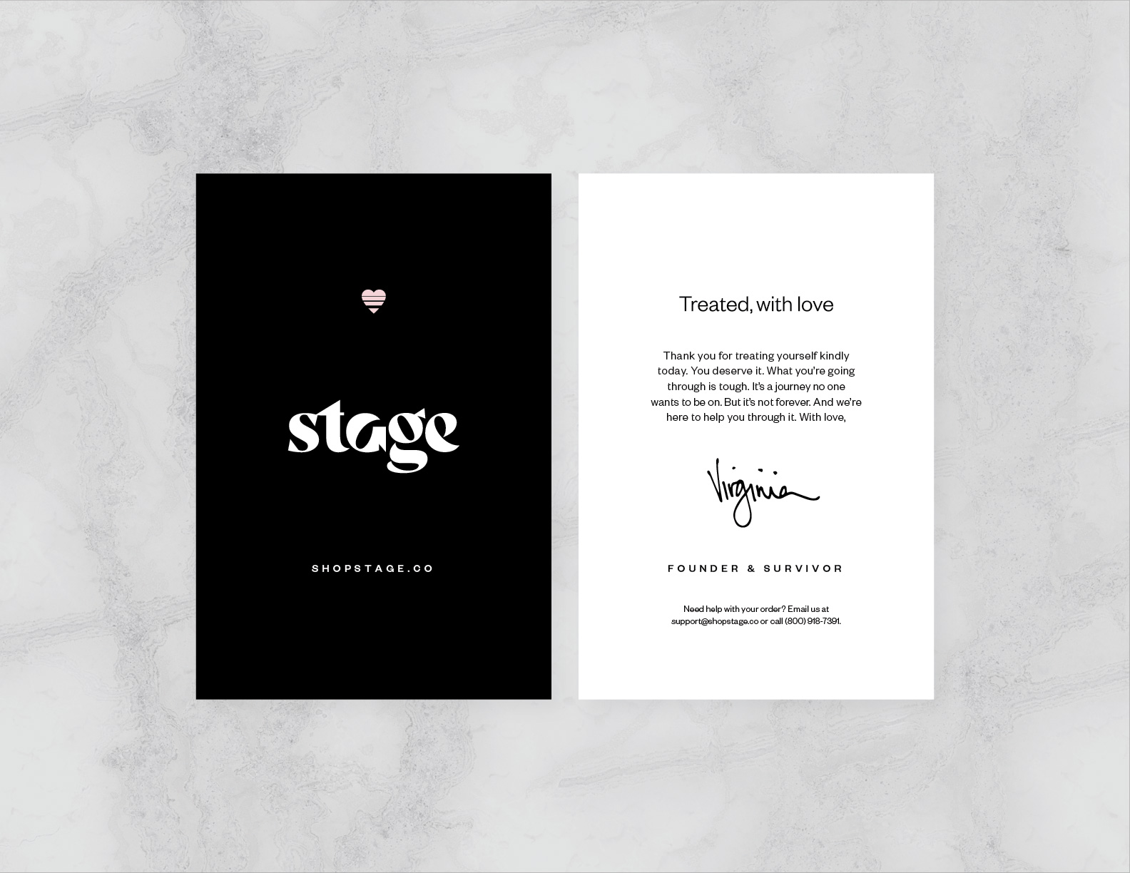
Likewise, the verbal identity speaks to both sides. We developed messaging with warmth and kindness, while simultaneously acknowledging the painful realities of cancer. We took care not to minimize the challenges, at the same time offering moments of inspiration and uplift. With this in mind, Design Minded developed complete verbal identity guidelines for tone of voice, persona, brand line, formulas, blurbs, and boilerplates. The poignant brand line, ‘Treated, with love’ is used prominently throughout.
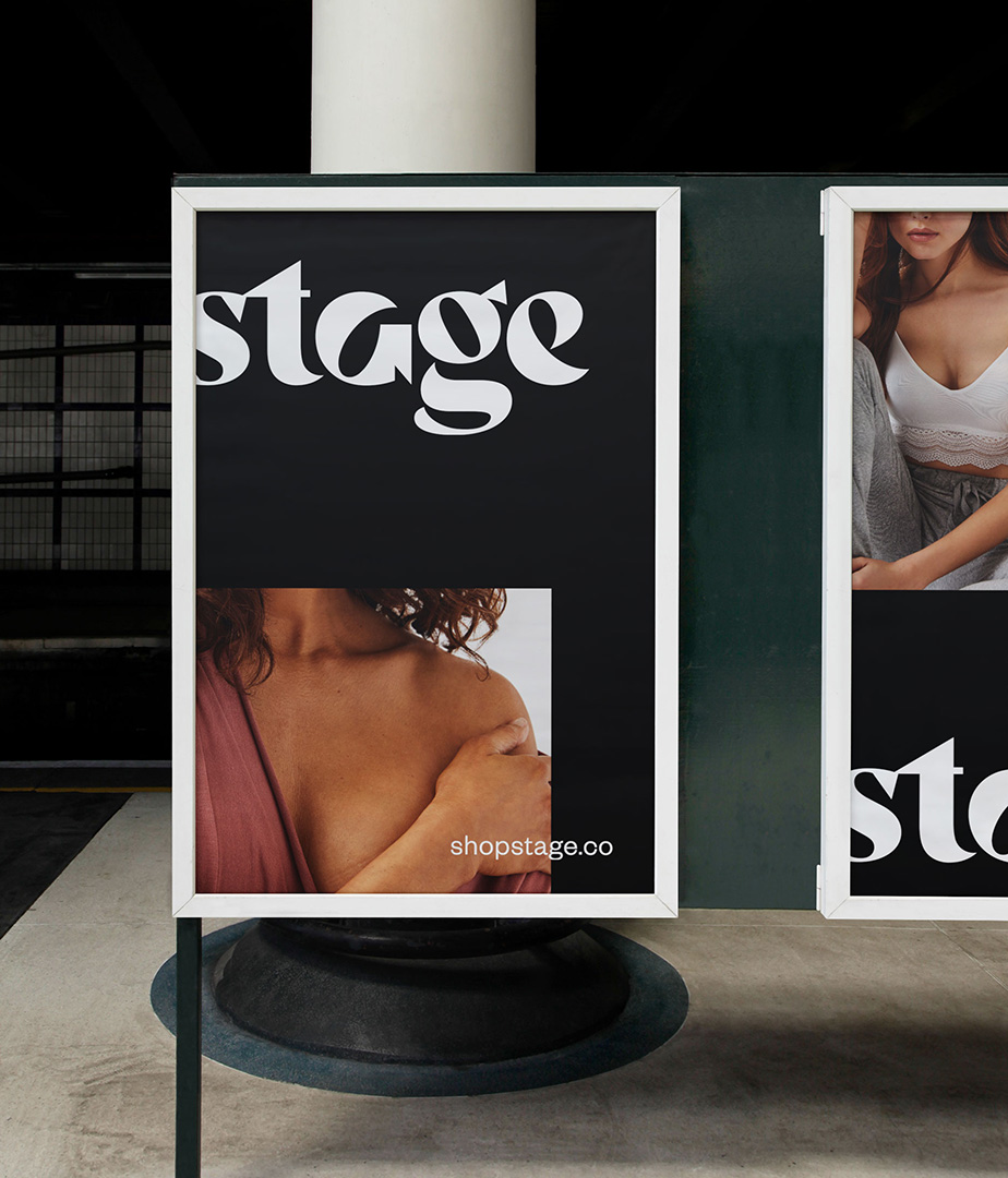
For the visual identity, we created an intentionally disfigured wordmark to embody our brand idea, ‘Cuts and Curves.’ Strong custom lettering—bold, beautiful, and feminine—was purposefully marred by cuts and imperfections. By design, this was meant to convey a scalpel slicing through, with the blade resting in the letter ‘a.’
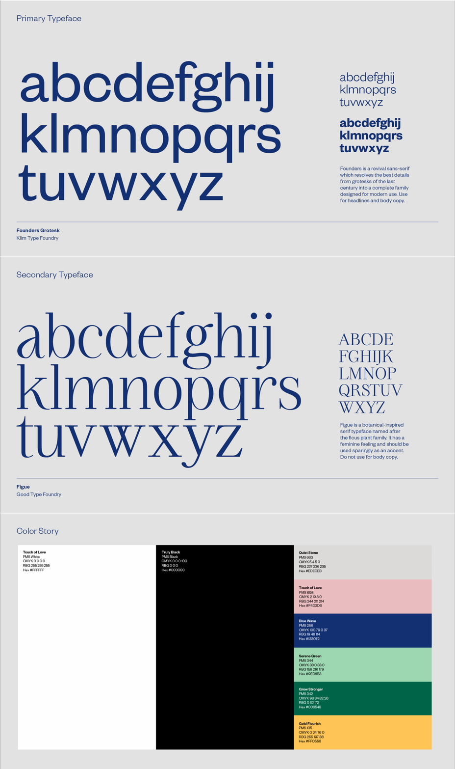
Wanting to symbolize the journey and passage of time, we created a secondary icon of a heart interrupted by horizon lines. The meaning was one of love, support, and new days ahead. Other aspects of the visual identity system were created thoughtfully, often accenting contrasts and intentional deformity. Even the layout grid was made with opportunities for on-purpose imperfection. From type to color to imagery, this brand was uniquely designed to contrast soft femininity with fierce toughness. Cancer treatment isn’t pretty. Yet the women enduring it are beautiful. This yin and yang gave us a lot to work with creatively.
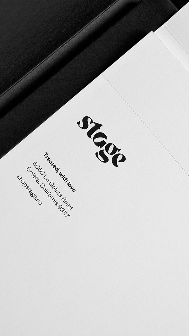
Ultimately, we completed the project with website design, packaging design, branded templates, and various applications of print and digital collateral. Since its launch, we’ve been inspired by the comfort and connection that Stage has offered countless women, as a resource and confidant during this defining moment in their lives.

