NYCxDESIGN
NYCxDESIGN is an annual event that celebrates design and creativity across New York City. Over the past decade, the festival has grown from a small gathering of like-minded creatives to a city-wide festival spanning all five boroughs.
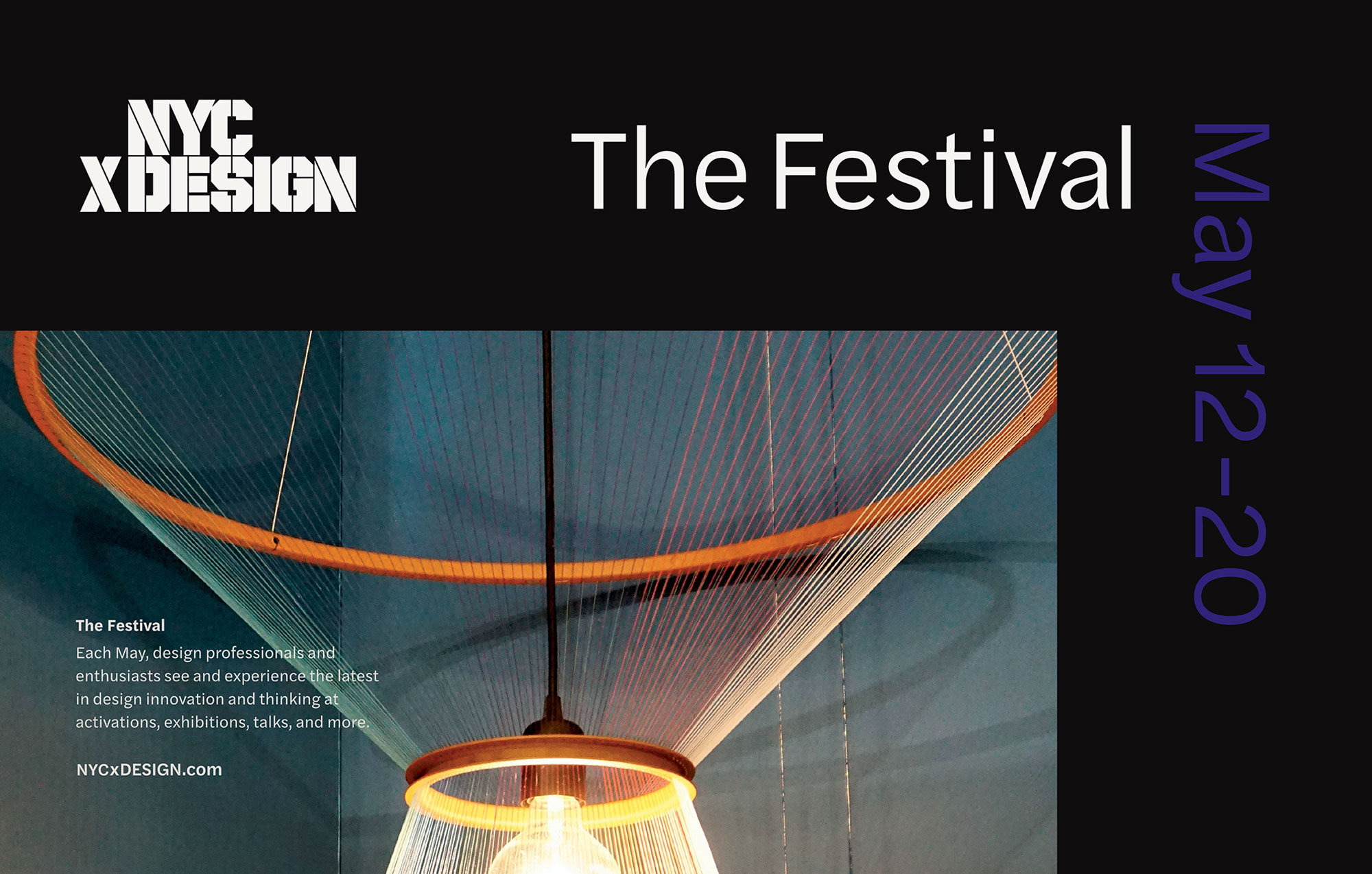
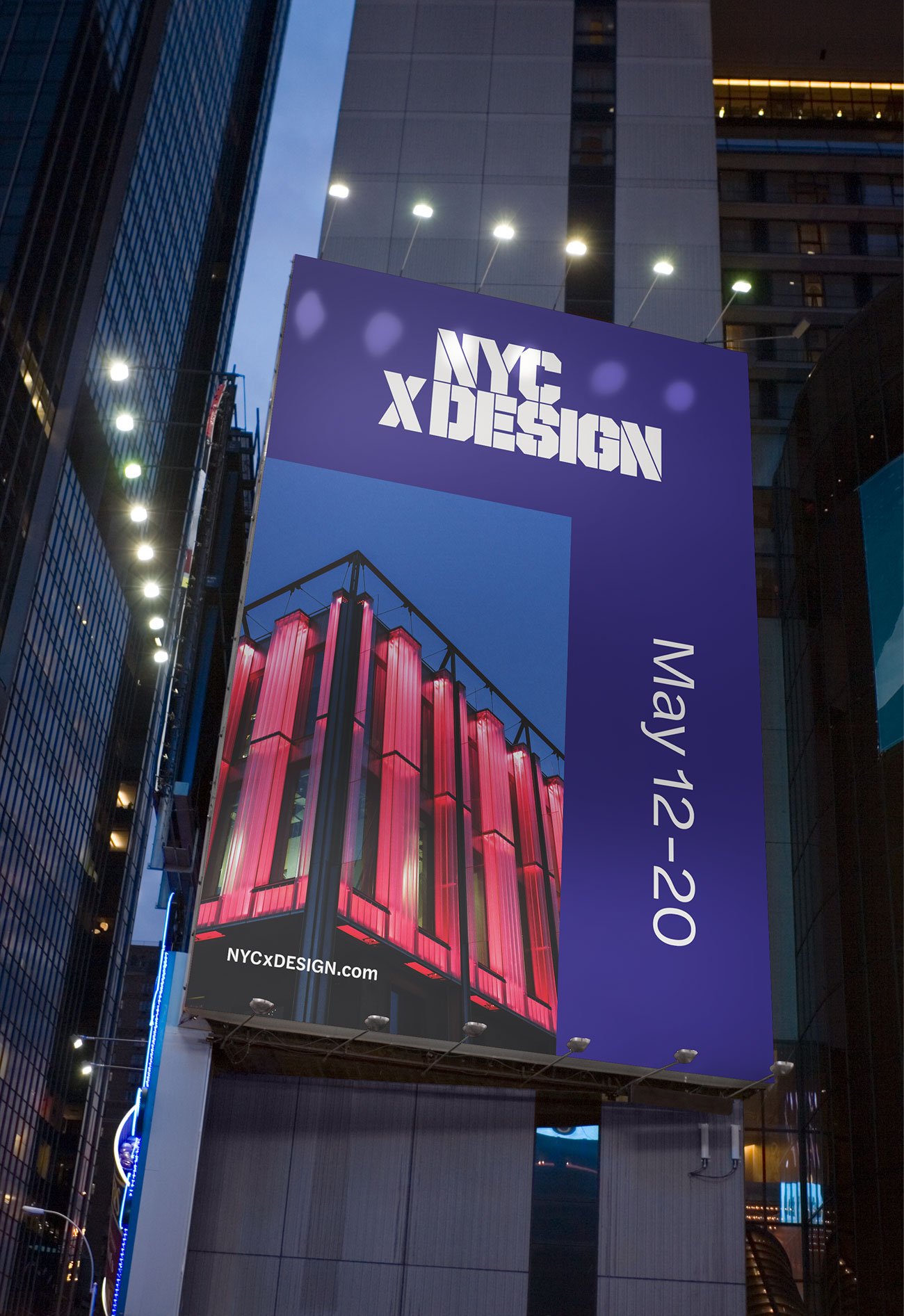
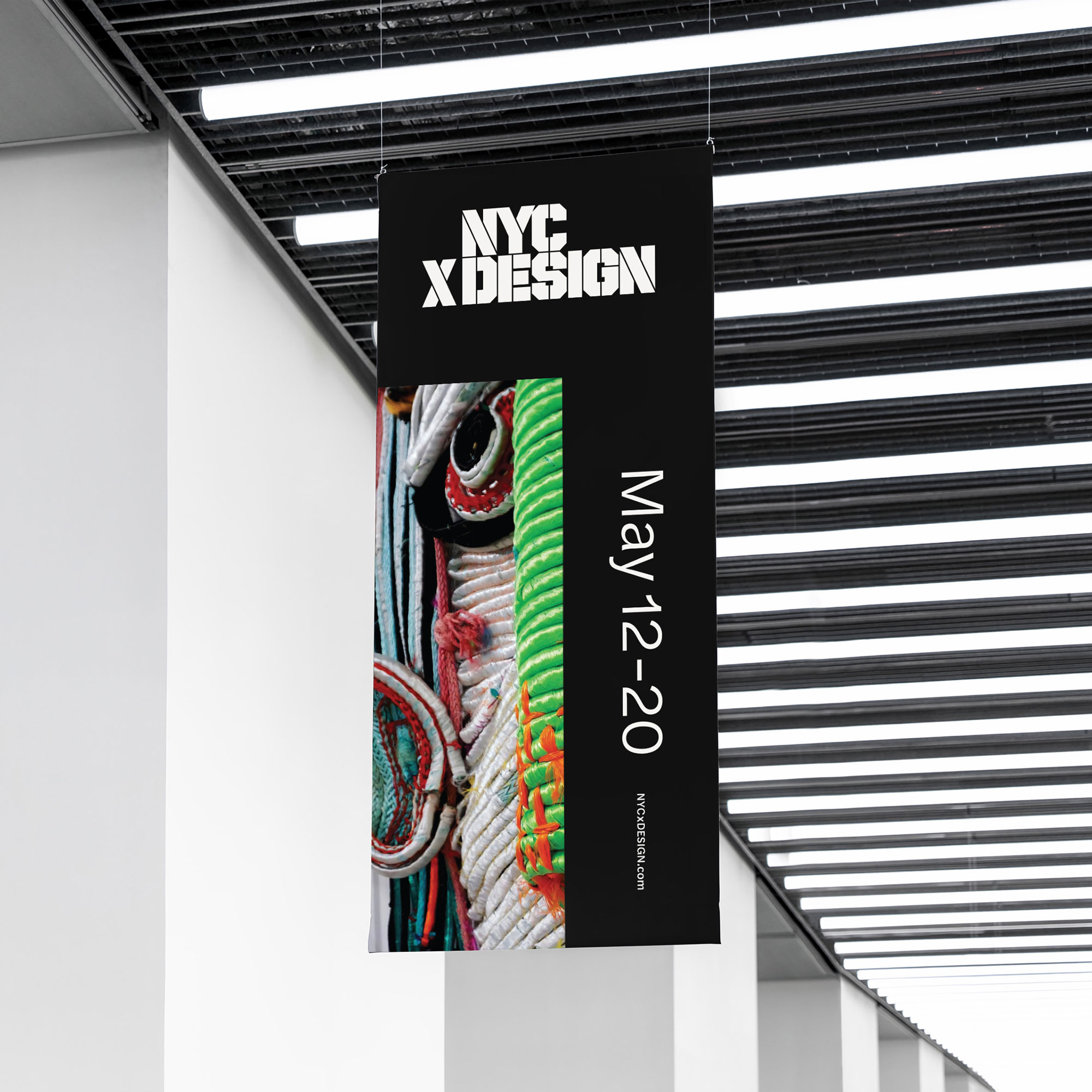
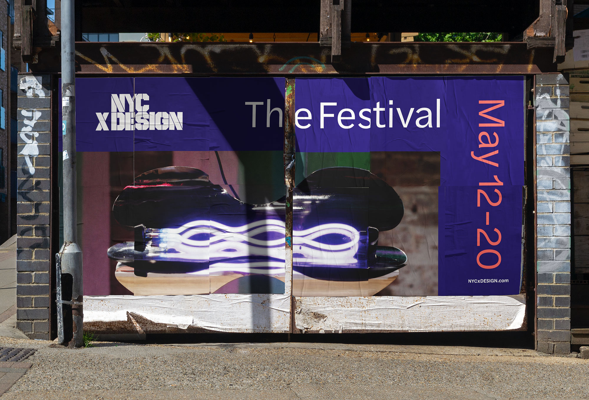
Design Minded has been working with NYCxDESIGN for years to develop their annual campaign collateral, which advertised upcoming events on bus shelters and billboards across New York City.
In 2020 we were invited to give the brand a long overdue refresh. This included cleaning up the logo, establishing typography and colors, and developing a design system that would last for years to come.
- brand uplevel
- visual identity
- brand guide
- activation
- website design
- campaign collateral
- digital design
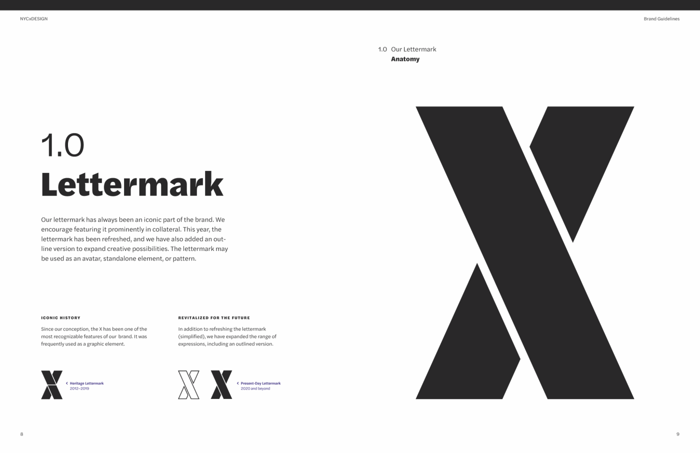
NYCxDESIGN already had a strong logo, which was initially created in 2012 by Base Design. We kept this iconic aspect of the identity, which had become recognizable in its own right. Modest typographic refinements were applied to improve wordmark spacing. In particular, we tightened up a generous gap between the “X” and the rest of the lockup. Our goal was to retain the integrity of the original mark, while making carefully considered adjustments for visual balance and alignment.
Another enhancement was elevating the “X” as a signature icon. Over the years, this element had been increasingly used as a standalone mark, and we wanted to give it even more opportunities to shine. With this in mind, we developed “X” graphic treatments as patterns, outline, image containers, and backgrounds. This range would enable a spectrum of application options for years to come.
Typographic direction was also established. Design Minded worked closely with NYCxDESIGN to explore different options and implications. Ultimately, we selected Halyard by Joshua Darden as the brand’s primary and only typeface. With a robust family of weights, we knew this distinctive choice would work for any use case, and perform well across digital and print. As an added bonus, Darden Studio is based in Brooklyn, which seemed fitting for an organization with a mission to support the design community in New York City.
This was a welcome initiative for NYCxDESIGN organizers, who had long been wanting typographic consistency. Prior to this uplevel, the brand didn’t have much in terms of type guidelines, and after seven years of anything-goes, it had inadvertently accumulated a mish-mosh of fonts and styles. In the most egregious cases, our design audit found instances where Ariel, Futura, Helvetica, and Univers were all being used, at the same time, in the same layout. With clarity and guidance, the brand could embark on a much-needed clean-up.
As for color, the original identity called for a vibrant cyan, which had initially worked very well. However, NYCxDESIGN is an annual festival, and after several consecutive festivals using the same bold color, organizers realized a need for yearly distinction. Design Minded established a fuller color palette and a plan for a dynamic impact color, which would change each year. This way, festival artwork could be refreshed annually, while maintaining long-term cohesiveness year-to-year.
The work we did for NYCxDESIGN was a thoughtful evolution. The intent all along was to elevate the best of what already existed, while paving the way for growth as the festival continues to gain recognition and expand beyond expectations. The initial identity was just right for launching a fledgling event back in 2012. We simply enhanced an already-good foundation with a more robust toolbox, typography, color story, proof-of-concept examples, and complete brand guidelines. The new visual identity and design system is now adaptable and dynamic, enabling consistency while allowing for yearly creativity.